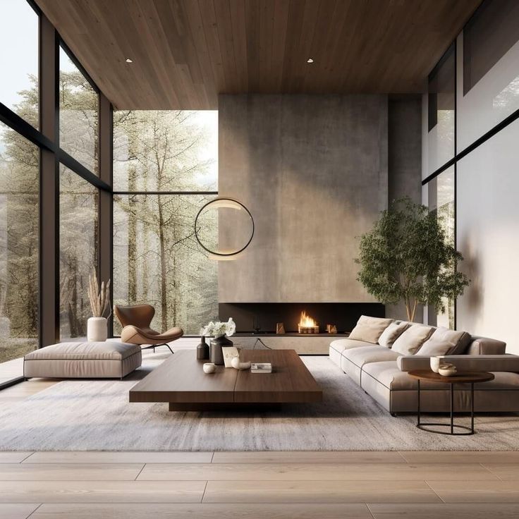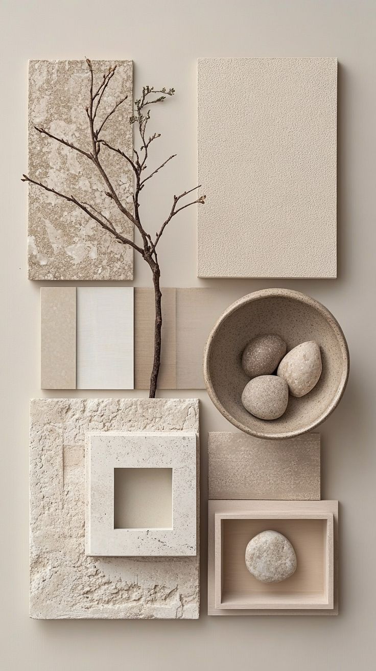
1. Grounded Neutrals with Warm Undertones
Neutrals have always been a cornerstone of interior design, but in 2025, they are evolving into something richer and more inviting. While crisp whites and cool grays once dominated modern interiors, homeowners are now gravitating toward neutrals with warmth and softness. Think soft ivory, stone beige, creamy almond, and putty taupe. These tones shed the starkness of cold grays and instead introduce a feeling of calm, sophistication, and livability.
What makes these neutrals so versatile is their ability to act as both a backdrop and a feature. They are subtle enough to allow bolder elements — art, furniture, or accent colors — to shine, yet layered enough to carry a space on their own when paired with tactile finishes.
How to use it:
- Apply warm neutrals to walls and cabinetry for a timeless foundation.
- Pair with organic textures such as linen curtains, woven rugs, oak wood flooring, or cane furniture to prevent the palette from feeling flat.
- Add dimension by layering multiple shades of warm neutrals in one room — for example, combining ivory walls with taupe upholstery and beige accent chairs.
- This palette is ideal for Scandinavian-inspired spaces, Japandi interiors, or transitional homes that seek elegance without sterility.
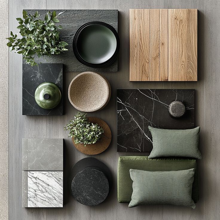
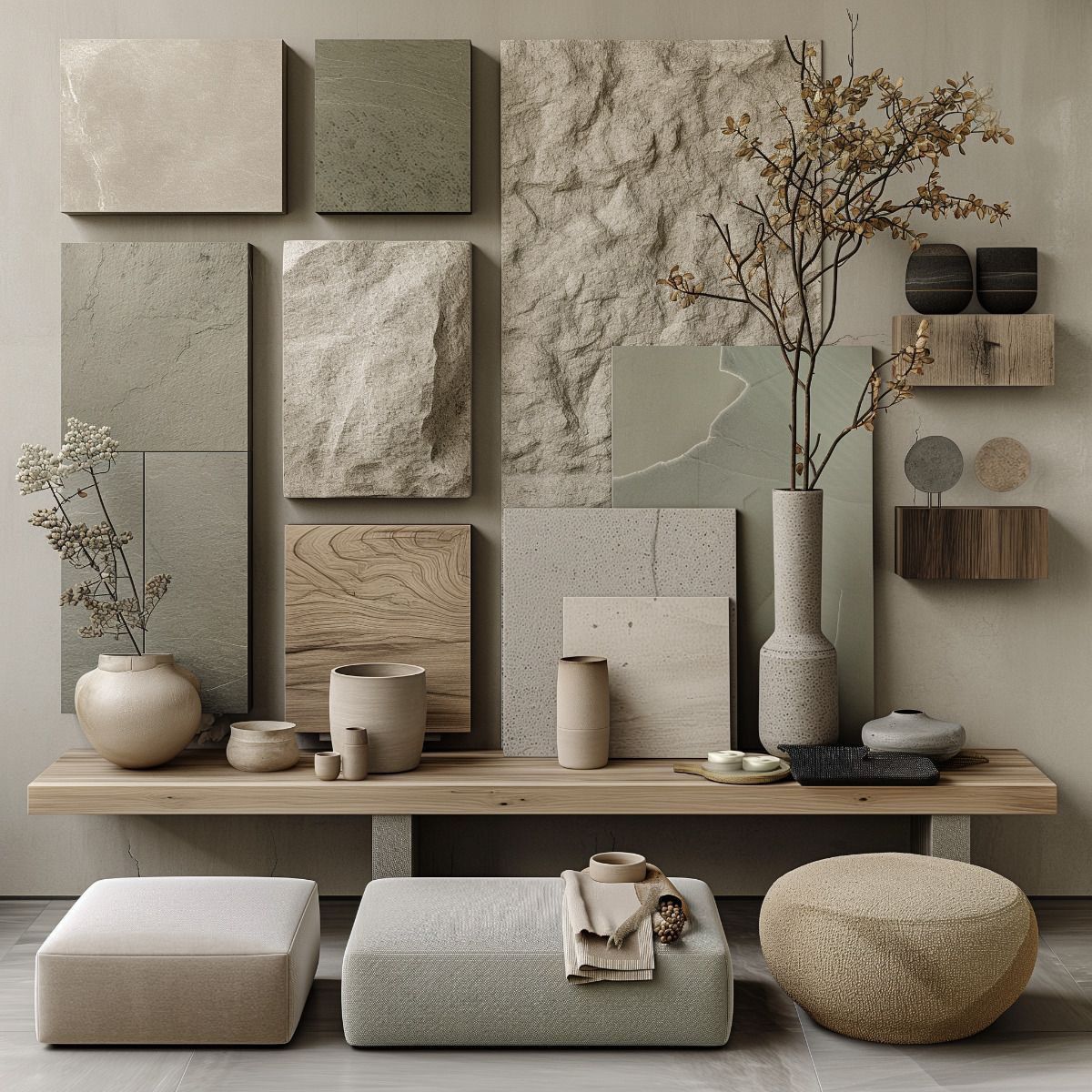
2. Deep Earthy Greens
Green has been trending for several years, but in 2025, it reaches a new level of depth and sophistication. Gone are the bright emeralds or lime hues; instead, earthy tones like forest, olive, sage, and eucalyptus are taking center stage. These shades mirror the natural world, grounding spaces and creating a restorative environment that feels timeless.
Psychologically, green is associated with balance, renewal, and growth, which makes it a natural choice for interiors that seek harmony. Its versatility is unmatched — lighter olive shades bring calm to kitchens and bedrooms, while darker forest tones add drama and luxury to dining rooms, libraries, or accent walls.
How to use it:
- Consider deep olive cabinetry with brushed brass hardware in kitchens.
- Use eucalyptus green tiles in bathrooms for a spa-inspired look.
- Anchor living spaces with a forest green sofa or accent wall, softened with warm neutrals and natural woods.
- Pair greens with brass, black, or warm oak for a balanced, modern look.
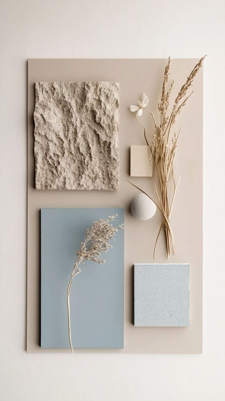
3. Ocean-Inspired Blues
In 2025, blues take their cue from the ocean, ranging from soft aquas and dusty teals to bold navies. These colors evoke tranquility, stability, and connection — qualities many homeowners are craving in their living environments. Unlike previous years, where navy dominated as the go-to bold blue, this year’s palette introduces more nuanced shades, reflecting the layered tones of water and sky.
Blues are among the most versatile colors in design. Lighter shades bring freshness and serenity, perfect for bathrooms and bedrooms, while darker shades convey drama, elegance, and grounding, ideal for kitchens, dining rooms, or formal spaces.
How to use it:
- Incorporate muted aquas on walls or textiles to create a soothing spa-like retreat.
- Use dusty teal cabinetry in kitchens or built-ins to introduce depth without overwhelming.
- Pair bold navy with crisp white trim for a classic yet modern contrast.
- Complement ocean-inspired blues with driftwood finishes, rattan accents, or brushed nickel fixtures to capture a coastal contemporary look.
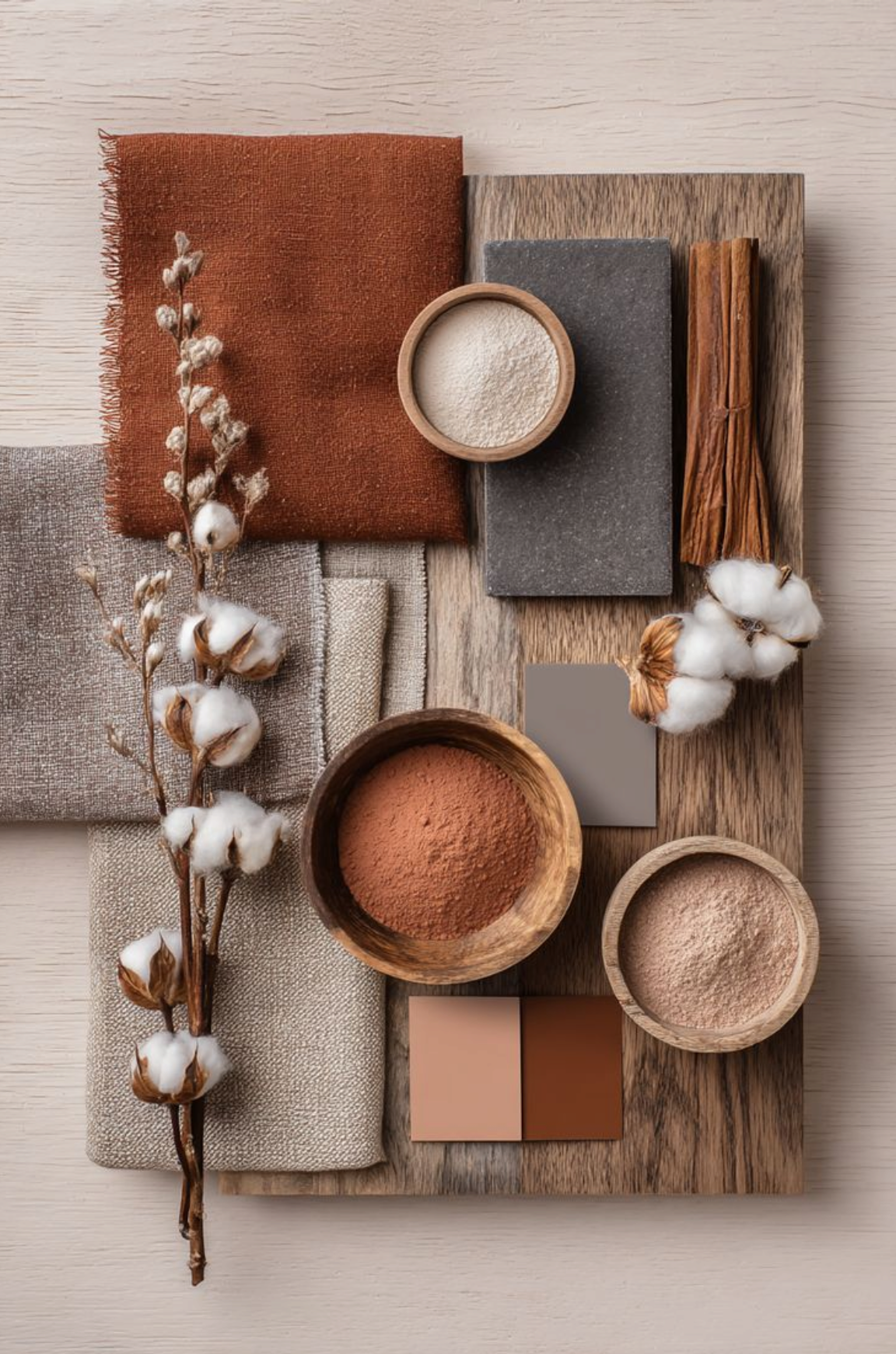
4. Sun-Baked Terracotta and Clay
Warmth is making a comeback in 2025, and sun-baked hues like terracotta, burnt sienna, rust, and clay are leading the way. These colors channel natural landscapes — think Mediterranean villas, desert canyons, and earthen pottery. They bring a sense of grounded authenticity to interiors, making spaces feel cozy, tactile, and welcoming.
Terracotta and clay are particularly effective in transitional and eclectic homes, where they bridge the gap between rustic charm and modern sophistication. Their earthy quality pairs well with natural stone, matte black accents, and warm neutrals, offering a palette that is both rooted in tradition and entirely current.
How to use it:
- Incorporate terracotta tiles in kitchens, entryways, or bathrooms to add rustic texture.
- Try a clay-toned feature wall in a living or dining room for instant warmth.
- Pair these hues with matte black fixtures for contrast, or natural stone for a Mediterranean-inspired vibe.
- Add textiles such as rust-colored throw pillows or terracotta-toned rugs to subtly introduce the trend.
5. Muted Pastels with Depth
Pastels aren’t disappearing — they’re evolving. The 2025 approach favors muted, complex pastels rather than bright, sugary tones. Think dusty rose, misty lavender, pale sage, and powdery peach. These shades feel elevated and sophisticated, offering just enough color to make a statement without overwhelming a room.
Unlike traditional pastels, which can sometimes feel juvenile, these muted variations bring maturity and depth. They work beautifully alongside neutrals, woods, and metallics, adding personality in a subtle, contemporary way.
How to use it:
- Choose dusty rose upholstery or pale sage cabinetry for a modern, refined pop of color.
- Use misty lavender on bedroom walls for a calming, romantic effect.
- Incorporate muted pastel ceramics, linens, or accent chairs for small yet impactful touches.
- Balance pastels with natural materials like oak, stone, or brushed metal for contrast.
Final Thoughts: Designing with Emotion in 2025
The color trends of 2025 are less about fleeting fashion and more about creating interiors that feel emotionally connected and deeply personal. Whether you gravitate toward grounded neutrals, earthy greens, ocean-inspired blues, sun-baked clays, or muted pastels, the guiding principle is the same: choose colors that resonate with your lifestyle, values, and sense of comfort.
Design in 2025 is about more than aesthetics — it’s about wellness, sustainability, and intentional living. By incorporating these palettes thoughtfully, you can craft a home that not only looks beautiful but also supports your everyday life, nurturing both body and mind.